 Tone Caliper
Grade toward a reference image
Drop an image onto the color wheel to plot its colors beside your own photo's, then grade until your colors reach them.
Drag an image onto the color wheel and its colors are plotted there as outlined squares, among your photo's own dots — a target to grade toward, right beside where your colors sit today.
A reference is read, never applied. Dropping one changes nothing in your edit, so there is nothing to undo: a photo shows where its colors ended up, not where they started, and which color in your frame belongs there is yours to decide.
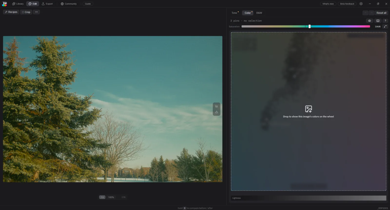
Drop an image on the wheel
With a photo open on the Color tab (2), drag an image file onto the wheel — a JPEG, PNG, TIFF, GIF, or HEIF. The wheel reframes so both sets of colors are in view, and the reference opens beside your photo.
The two layers
Your photo stays the familiar cloud of filled dots. The reference is drawn as outlined squares. They are read-only: they never move, and they can't be clicked, selected, or dragged.
To watch your colors travel toward the squares as you drag a pin, switch the wheel's Color points to Live — the gear in the wheel's bottom-right corner. On the default Static setting your dots stay at your photo's original colors, which makes the gap easy to read but does not animate as you close it. See the color wheel for both behaviors.
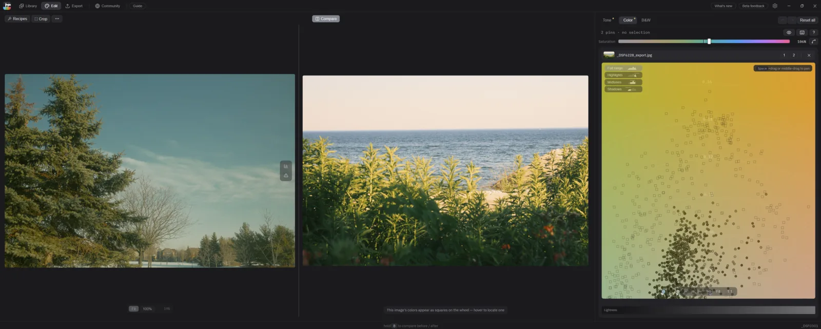
Grade toward the squares
Find a part of the wheel where your dots and the squares disagree, place a pin on that color, and drag until your dots sit over the squares. See Editing colors for placing and shaping pins.
The Working range chips narrow both layers together, so tapping Highlights compares only the bright colors of each — like against like, rather than a whole reference against one band of your photo.
Put them side by side
Once a reference is loaded, a Compare button appears at the top center of the photo area and opens the reference beside your photo. Hovering anywhere on the reference puts a crosshair on the wheel at that color's position, the same way hovering your own photo does — that is how you tie a color you can see in the picture to a square you can aim at. Drag the divider to resize the panes, double-click it to reset.
The reference chip
Above the wheel, 1 shows or hides your photo's colors and 2 the reference's, which is how you read one layer alone where the two overlap. Both are display-only. ✕ removes the reference.
A reference stays loaded when you move to another photo, so you can grade a whole set against one target. It lasts for the session.
For what the disc's axes mean, see The color wheel.
Try this with your own photo — Tone Caliper is a free trial on Windows and macOS.
Download free trial